Understanding the Principles of Responsive Web Design
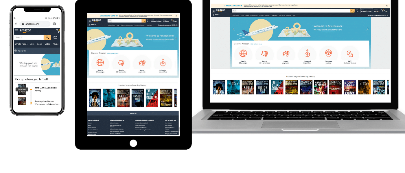
Responsive Web Design (RWD) is a crucial approach for creating websites that provide an optimal viewing experience across a wide range of devices, from desktops to mobile phones. This principle is grounded in the idea that a website should adapt to the user's behavior and environment based on screen size, platform, and orientation. Utilizing fluid grids, flexible images, and CSS media queries, developers can ensure that their websites remain functional and visually appealing regardless of the device used. For a deeper dive into fluid grids and their significance, you can check out this Smashing Magazine article.
One of the key benefits of Responsive Web Design is the enhancement of user experience. By eliminating the need for different layouts for various devices, web designers can streamline content delivery. This leads to reduced bounce rates and increased engagement, ultimately contributing to better SEO performance. Google has confirmed the importance of a responsive design, stating that it helps in achieving better search rankings. For further insights on how RWD impacts SEO, see this Google Developers guide.
Top 10 Tools for Creating Responsive Websites
In today's digital landscape, creating a responsive website is essential for ensuring an optimal user experience across various devices. Here are the top 10 tools that can help you craft responsive designs effortlessly:
- Adobe XD: A powerful design tool that allows you to create, prototype, and share your responsive web designs.
- Figma: A collaborative interface design tool that enables real-time collaboration and offers great features for responsive web design.
- Bootstrap: A front-end framework that provides pre-styled components to help you build responsive layouts quickly.
- Tailwind CSS: A utility-first CSS framework that provides low-level utility classes to design custom, responsive websites rapidly.
- Wix: An easy-to-use website builder with built-in responsive design features.
Continuing with our list, the following tools will also enhance your ability to create responsive websites:
- WordPress: The most popular content management system that offers responsive themes and plugins to customize your site.
- Google Mobile-Friendly Test: A free tool to test your website's responsiveness and identify any adjustments needed.
- Squarespace: A website builder that offers a range of beautiful templates that are mobile-responsive out of the box.
- SEMrush: While primarily an SEO tool, it offers insights into how well your site is optimized for mobile and responsive design.
- CodePen: An online code editor that allows you to experiment with responsive designs and see real-time results.
How Responsive Design Impacts User Experience and SEO
Responsive design plays a crucial role in enhancing user experience across various devices. With the increasing use of smartphones and tablets, a website that adapts seamlessly to different screen sizes ensures that users have a consistent and enjoyable experience. According to Smashing Magazine, a responsive layout not only improves usability but also minimizes the bounce rate, as users are less likely to leave a site that is difficult to navigate. This adaptability leads to longer session durations and increased interaction, both of which are vital for a positive user experience.
From an SEO perspective, responsive web design is favored by search engines like Google, which prioritize mobile-friendly sites in their rankings. A Search Engine Journal article emphasizes that having a single URL for all devices simplifies the indexing process and enhances crawl efficiency. Additionally, with Google’s mobile-first indexing, responsive design ensures that your content is easily accessible and well-optimized, leading to better visibility and increased organic traffic. In the competitive digital landscape, investing in responsive design is not just a user-centric decision but a strategic SEO imperative.