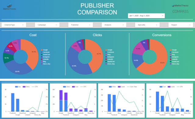
The Power of Infographics: How Visual Data Transforms Information
In today's information-saturated world, infographics have emerged as one of the most effective tools for conveying complex data in a digestible format. By combining graphics, charts, and concise text, infographics transform dense statistics into visually appealing representations that engage the viewer. Studies suggest that people process visuals significantly faster than text, making infographics an invaluable asset for marketers, educators, and business professionals alike. They not only grab attention but also improve retention rates, ensuring that key messages are remembered long after the initial viewing.
Furthermore, the use of visual data in presentations and digital content can enhance storytelling by providing context and clarity. Infographics allow creators to curate a narrative that guides the audience through the information. According to HubSpot, incorporating visuals can increase engagement by up to 94%. Whether used in reports, social media campaigns, or educational materials, infographics translate complex ideas into clear insights, making them essential for anyone looking to improve understanding and influence decision-making.
Beyond Numbers: Creating Compelling Data Visualizations That Captivate
In today's data-driven world, the ability to present information visually is crucial for capturing attention and enhancing understanding. Compelling data visualizations go beyond simple charts and graphs; they weave a narrative that engages viewers on a deeper level. By employing techniques such as color theory, contrasting patterns, and innovative design layouts, creators can transform raw data into a story that resonates. For a deeper dive into effective visualization techniques, consider reading Data Visualization: A Guide to Visual Storytelling.
The key to successful data visualization lies in its ability to simplify complex information while maintaining accuracy. According to a study by the British Psychological Society, well-designed visuals not only aid comprehension but also enhance retention. To create visuals that captivate, think about your audience's needs and frustrations. Using tools like Tableau or Canva can streamline this process, allowing for the creation of eye-catching graphics that inform and engage.
What Makes a Great Data Visualization? Key Elements to Consider
Data visualization is a powerful tool for conveying complex information in a clear and engaging manner. A great data visualization effectively combines several key elements to ensure the message is communicated efficiently. First, clarity is crucial; the visual must be easy to understand at a glance. Choose the right type of chart or graph that accurately represents the data and avoids clutter. Second, context plays a significant role in understanding the narrative behind the data. Providing accompanying text or labels can help the audience grasp the implications of the visualization. For more insights on visual storytelling, check out this guide on data journalism.
Design aesthetics also contribute to the effectiveness of data visualizations. Utilizing a harmonious color palette enhances the visual appeal and aids in the differentiation of data points. Moreover, it’s important to maintain a balance between information density and simplicity. Overloading the audience with too much information can lead to confusion, whereas a streamlined design can facilitate better comprehension. To understand the principles of effective design, refer to this NNG article on data visualization principles. By focusing on these elements, you can create impactful data visualizations that resonate with your audience.
