The Science of Attention: Understanding User Distraction in Digital Environments
The digital landscape is overflowing with information, making user distraction an unavoidable challenge. According to research from Nielsen Norman Group, users often switch between tasks or platforms, leading to fragmented attention spans. This phenomenon can be characterized by several factors, including multitasking, notifications, and the design of digital interfaces. Each of these elements competes for our cognitive resources, making it essential for content creators and marketers to understand how to capture and maintain attention effectively.
Understanding the science behind user distraction can lead to better engagement strategies. Studies indicate that multitasking reduces productivity and can impair learning. To counteract this, creators need to implement design principles that facilitate focus, such as minimizing distractions in user interfaces and optimizing content for quick consumption. By leveraging findings from cognitive psychology, blogs and websites can be tailored to not only inform but also to hold the attention of users in an increasingly busy digital world.
10 Design Principles to Minimize User Distraction on Your Website
In today's digital landscape, maintaining user focus is crucial for any website's success. Implementing effective design principles can significantly minimize user distraction, allowing visitors to engage more with your content. Here are some fundamental guidelines:
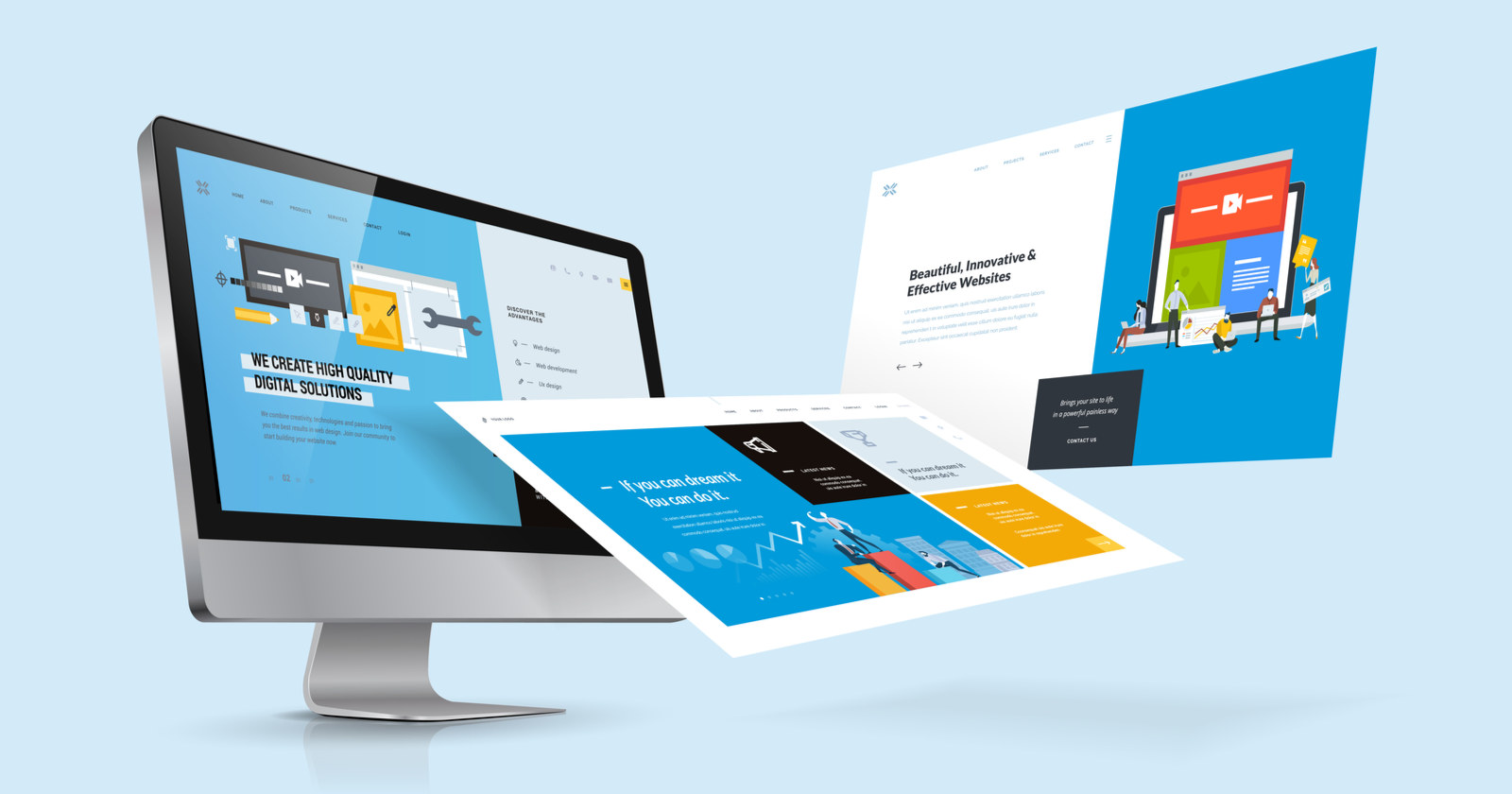
- Visual Hierarchy: Organize elements by importance using size, color, and spacing. This helps guide the user's attention to key information.
- Consistent Styling: Maintain a uniform color scheme and typography across your site. Inconsistencies can confuse users and detract from their focus.
- Whitespace: Use ample whitespace to reduce clutter and create a cleaner look. This practice can enhance readability and keep users centered on the content.
Moreover, consider the layout and navigational structure of your site. Clear Navigation ensures users can find what they are looking for without feeling overwhelmed. A well-structured menu can make a world of difference. Additionally, minimizing pop-ups and reducing the number of interstitials can significantly improve the user experience. Aim to present only essential information upfront, letting users delve deeper as they wish. Incorporating these design strategies can have a profound impact on user engagement and satisfaction.
How Can Visual Hierarchy Improve Focus in Web Design?
Visual hierarchy is a fundamental principle in web design that enables users to quickly process information on a page. By strategically using elements such as size, color, and contrast, designers can guide the viewer's eye to the most important aspects of a layout. This not only enhances readability but also improves user experience by allowing users to easily navigate and find key information without frustration.
Incorporating visual hierarchy helps maintain focus by creating a clear path for the viewer’s attention. For instance, placing essential content at the top of the page or using larger fonts for headings can ensure that users absorb crucial messages first. Additionally, implementing white space effectively can reduce visual clutter and improve concentration. As highlighted by UX Design, a thoughtful arrangement of elements not only makes a webpage aesthetically pleasing but also significantly enhances the overall engagement of visitors.