Understanding the Fundamentals of Responsive Web Design
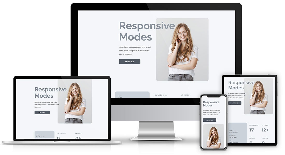
Responsive Web Design (RWD) is a design approach aimed at making web pages render well on a variety of devices and window sizes. The core principle is to create a single website that provides an optimal viewing experience, whether on a desktop, tablet, or smartphone. This involves using flexible grids, layouts, and images that can adapt to the screen size. By implementing media queries, designers can apply different styles depending on the device's characteristics, ensuring that content is easily readable and navigable without unnecessary scrolling or zooming.
Understanding the fundamentals of Responsive Web Design also includes recognizing the significance of accessibility and usability. A responsive website not only improves user experience but also enhances SEO performance, as search engines favor websites that deliver optimized experiences across devices. Key components of RWD include:
- Fluid Grids: Utilizing percentage-based widths for layout elements.
- Flexible Images: Applying CSS properties to ensure images resize within their containing elements.
- Media Queries: Structuring CSS to respond to different screen sizes and orientations.
By mastering these elements, web designers can create sites that look great and function effectively on any device.
How to Optimize Your Website for All Screen Sizes
In today's digital landscape, optimizing your website for all screen sizes is essential to enhance user experience and maintain engagement. Start by adopting a responsive design framework that adjusts your layout based on the device's screen size. Use CSS media queries to set breakpoints where your design needs to change, ensuring your website looks great on desktops, tablets, and smartphones alike. Furthermore, consider incorporating a fluid grid system that allows your content to resize seamlessly. This approach not only enhances accessibility but also bolsters your search engine optimization (SEO) efforts by improving mobile usability.
Another critical factor in optimizing your website for all screen sizes is the proper use of images and media. Ensure that images are responsive using the srcset attribute and CSS techniques to define multiple sizes for different resolutions. By doing so, you can prevent unnecessary loading times, which is crucial for mobile users. Additionally, leverage viewport meta tags to control layout on mobile browsers and provide a better browsing experience. Lastly, regularly test your website on various devices and screen sizes using tools like Google’s Mobile-Friendly Test to identify and resolve any issues that may arise.
Common Challenges in Responsive Web Design and How to Overcome Them
Responsive web design presents a range of challenges that developers and designers must navigate to create a seamless user experience across various devices. One common challenge is ensuring consistent typography. Different screen sizes can alter the readability of text, leading to users struggling to absorb content. To overcome this, developers can utilize relative units (like em or rem) instead of fixed pixel sizes, allowing text to scale appropriately for various screens. Additionally, implementing CSS media queries can help adjust font sizes based on the viewport, enhancing readability for all users.
Another significant challenge is managing image responsiveness. Using large images can slow down page load times and impact SEO performance negatively. To address this, developers can adopt techniques such as responsive images using the srcset attribute in HTML, which allows browsers to select the appropriately sized image based on the device's resolution. Furthermore, implementing image compression tools can reduce file sizes without compromising quality, ensuring a faster loading experience across all devices.